Buttons
Buttons are hardly the focus of a UI kit. However, without them, a UI kit is not complete. We stepped one step further, we make the buttons both attrative and easy to use.
Icons
Each buttons has an IconStyle property. Setting this property will let developers quickly choose from over 50 built-in icons to create a consistent. If those icons are not your taste, change them via ThemeManager. Think of it like CSS for windows form buttons.
Animation
VUI's buttons by default has fade-in an fade-out effect. If that is not enough, write your own animation effect and plug it in.
True transparency
Like all other controls of VUI, buttons support transparency natively. Unlike .Net controls which fake transparency, we build our controls from scratch to make transparency works any where.
Built-in styles
- * Flat button
- * Crystal button
- * Bouncing
- * Image
Easy to style
Like web enviornment, VUI's buttons can be styled anyway a developer wants.
This screenshot is two normal buttons in black theme:

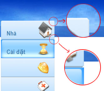
This screenshot show buttons with custom style:

Notice the regions highlighted by red circles. They prove that with true transparency, VUI's buttons naturally blends in with the background. To be specific, the upper of the background is an image, the bottom white part is a panel. True transparency allows a control to lie on top of multiple controls and still let the underlying controls to show through.